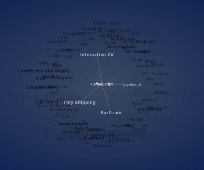
After having worked with software and web development for a number of years, it becomes difficult to write a good CV if you have worked on several projects, at several companies and with several technologies.
As a CV shouldn't be longer than a couple of pages, you have to cut down on the information. In my traditional (PDF CV), I chose to keep most of the projects I've worked on, but I didn't keep the information about the technologies I worked on for each of them.
But I work with computers. I should be able to create an interactive CV that contains all the information about projects, organizations and technologies and the relationship between them.
This lends itself naturally to visualization as a graph, I thought.

So I created the interactive CV where each project, organization and technology is a node in a graph. Click on a node to focus on it and see what it is related to. (Note: Clicking doesn't work on iOS and Android; you have to drag a node to select it. And it's untested on IE.)
I'm not sure the experiment was succesful. Even though I only added data for the projects from my last three employments, the graph got pretty tangled, but as the developer I'm not the right person to do a usability test. Let me know what you think!
Previous: Prioritizing Screenplain features
Next: Initializr cleanup